January 27, 2014
Recurring project budgets
Machinery needs a little bit of grease every now and then, software an update, and a home a cleaning. Some projects lack the one big final »Done!«—and a feature to budget them smoothly in mite. E.g., if you agreed with your client on maintaining a project for 20 hours a month, you had to add a new project every single month to keep a keen eye on its budget.
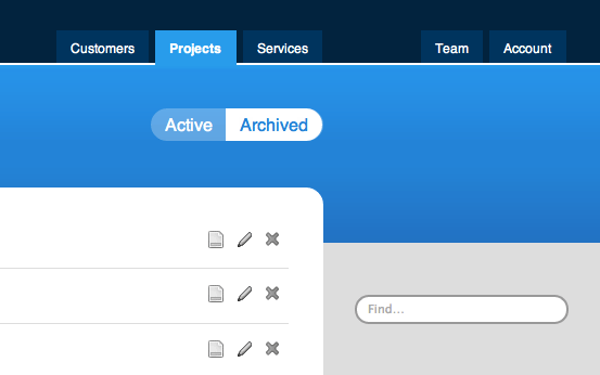
No more! You can now set a monthly budget for a project, too. As usually, you can budget in hours or euro or another currency. Simply choose the brand spanking new option »hours per month« or »euros per month«, when adding or editing a project on the tab »Projects«.
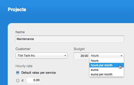
mite will then display the percentual useage of the monthly budget and the remaining or exceeded hours or euros in all the familiar places. If the budget exceeds 75%, it will show up on your dashboard report as ‘critical’. Budgets will always be displayed on »Reports => Projects« and on project reports, including possible shared reports.
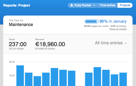
The project report of active projects will show the budget status of the current month in the upper right-hand corner. The report of archived projects will show the budget average instead.
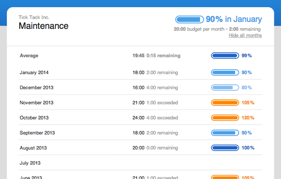
Click on »Show all months« to have a thorough look at the historical budget data, starting with the first month you tracked a time entry on.
If you did not track any time entries at all on a given month, the average will be calculated excluding this month. Add a time entry with 0:00 to force mite to include an easy-going month in the average.
Hopefully, this update will help you to manage recurring budgets more smoothly. We’d love to hear some feedback. Give it a try and tell us how it’s working for you. Thanks!
Julia in New features

