November 12, 2012
Select menus à la mite
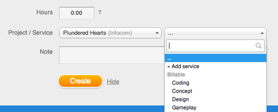
Goodbye standards, salut flexibility! From today on, a home-brewed version of an essential interface element is in operation in all modern browsers. Fully flavored à la mite, search included — please meet our new select menus:
![]()
Homebrewing gave us the chance to regain full control of the selects, and add some much-requested spice: search. Hopefully, this new flavor will simplify and speed-up every single choice, especially for teams and freelancers juggling a multitude of projects and/or services. Please make your voice heard how the new selects are working out for you. Feedback is much appreciated.
Thanks to all those user who got in touch to suggest this update, and to Chosen, the open source project which forms the foundation of our version. Merci for releasing the code!
~~
Update, November 13th: Thanks so much for your open and constructive feedback here, via Twitter and e-mail! You made yourself clear: thumbs up for the features, thumbs down for the look and feel. Especially with longer names, the new selects became less clear, and even a a hord of zebras galloping through the selects was spotted.
We heard you. We got back to work. And just published an update of the update. Thanks again for your honest feedback. We do hope that we got it right and really better this time!

~~
Update, November 14th: If you open the new selects, they now adapt their height to the space available in your browser window. You’ll see far more elements at a glance on bigger screens.
~~
Update, November 15th: You can now search for groups, too. E.g, search for a customer in the select »Project«.
~~
Update, January 28th: The new selects under the tab »Time tracking« now adapt their width to the space available, too. They show up to ten more characters.
Julia in New features
Got something to add?