December 9, 2011
Smarter charts
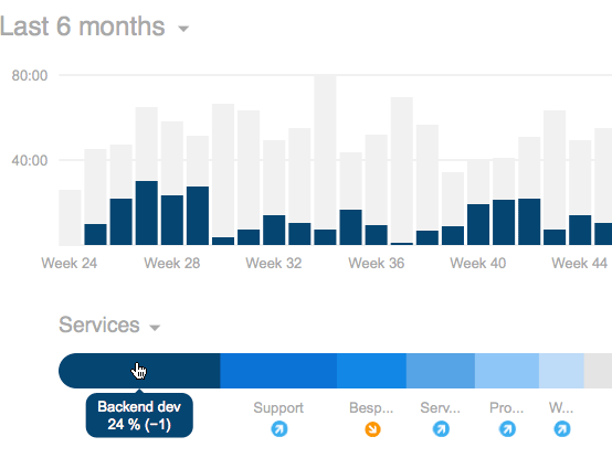
The bar charts on your dashboards, project reports, and shared reports just leveled up! Now, they’re not only able to display all hours or revenues, but also detailed information on services, projects, customers, or team members.

On your dashboard, hover your mouse over a section of the snake chart of services, projects, or customers. The bar chart will highlight those hours or revenues then. On project reports or shared reports, the bar chart behaves likewise: Hover your mouse over a row of a service or team member to see those hours highlighted in the bar chart.
Hopefully, this small update will help you to understand and analyze your time entries more in-depth!
Julia in New features
Got something to add?