August 19, 2010
Curtain up! New report dashboards
Who? What? Why? How? Did you know that? and What should we do about that? Yolk—the team serving mite—was all question marks during the last few weeks. And those questions kept coming, and coming, and coming. Normally, we would have stopped that immediately and would have tried to be a little more productive. This time, those question marks felt just great. They told us that we were up to something.
Every single one of those questions was a result of the new dashboards and the new information it was digging out for us. And that is exactly what we are trying to achieve: mite should be presenting data you are actively looking for, yes of course, but it should do even better: mite should distill this data to inform you. mite should help you understand your working time in depth. And it should report facts and trends. Proactively.
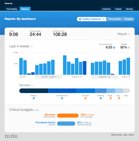
So here we go: curtain up, ladies & gentlemen! Meet your new dashboards – redesigned from scratch:

Features at a glance
Your new dashboards (formerly called: overview reports) feature three areas:
- Key figures:
- Today’s hours
- Current week’s hours
- Current month’s hours
- The last 4 weeks, the last 6 months, the last year:
- Chart: hours per day, week or month
- Chart: hours per service, project or customer
- Trends: comparing your hours to the preceding time frame
- Projects with budgets over 75 %
Hours versus revenue
You can switch your dashboard from a time perspective to a financial one. If you use the hourly rates within mite and if you’re browsing mite as a co-worker or an admin, mite will not only show you which customers, projects and services you’re working on for the lion’s share of your time, but also which ones are bringing in the biggest share of your revenue.
My dashboard, team dashboard, dashboards of your team members
Tracking your time in a team? If so, mite will also show every co-worker a team dashboard. If you’re an admin, you can also access the dashboard of every single team member.
Customization
mite remembers which information you’d like to see. So, if you choose the yearly view of the team once, mite will show you this view again as soon as you return to the dashboard.
Everything is connected
All parts of the new dashboards are linked with the underlying data. So if you want to explore what’s behind a peculiar spike in a chart, simply click on it: mite will show you the corresponding time entries.
Some tech-stuff on the new charts
We said good-bye to the old flash charts! On the new dashboards, we got rid of this technology, totally. Thus, all charts can be viewed without a special browser plugin. Plus, the bonus point: you can print charts, now.
Any feedback?
We do hope you find the new dashboards useful! Please tell us if you stumble upon any bugs or if you have any feedback on how they’re working out for you. Tadaa!
Julia in New features
Got something to add?