September 23, 2009
Filter 2.0
Unquestionable, we’re not running out of ideas how to push mite a little bit further, again and again. Even after almost three years of continuous development, there’s still so much to do, it’s amazing. The reporting section has been our main building site for the last few weeks, and will be for some more. There’s lots of potential to be tapped in this section. Today’s update package holds one new feature and a couple of smaller improvements. We hope you’ll like it!
New: Bookmarkable filters
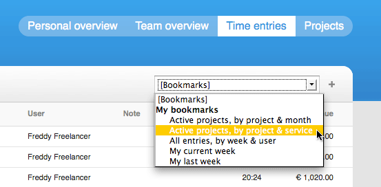
Under the tab »Reports => Time entries«, the heart of the reporting section, filtering and/or grouping became a whole lot faster today. Even the most complex filters can now be applied with a single click: just bookmark them.

A couple of default bookmarks are waiting for you already. Don’t need one of them? Please apply the bookmark in question, then click the »-« button on the right-hand side of the select menue to delete them. To add a new bookmark, select the corresponding filters and/or groups first. Then, add the bookmark by clicking the »+« button on the right-hand side of the select menue. If you’re tracking your time on a multi-user account, you can chose if the bookmark should be shared with other authorized members of your team, or not. Users are authorized to view team bookmarks if their rights are not restricted.
Redesigned: How to trigger filters
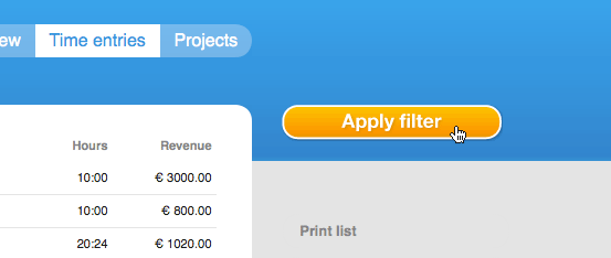
The lion’s share of today’s updates tend to improve the ease of use of mite‘s reporting section. We learned a great deal during the last years, above all not to go with our instincts only. Putting features to the real life test surely brings up issues you’d have never thought of otherwise. In this case, we were honestly surprised to experience that the huge orange button »Apply filter« on top of the sidebar, which triggered the filter box under »Reports => Time entries« and »Reports => Projects«, was overlooked, over and over again.

Some users simply didn’t spot this button, and therefore missed one of the best parts of mite. Yes, it was roughly a 5% percent issue, but with harsh consequences. Most interestingly, when pointed to the button, users couldn’t quite explain why they missed it in the first place. Was it because the orange color was associated with adding a new item? Was it because they took the button for a miscarried header of the other sidebar buttons (print, export etc.)? To be honest, we couldn’t get to the exact root of the problem. But we could and did try other versions of this button: we experimented, tested, retested and tested again. Finally, we came up with this new version. It is just a little bit inconsistent with other sections of mite, and will hopefully therefore manage to solve this issue:

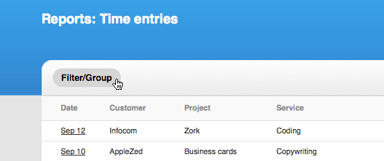
The button to trigger filters and/or groups now finds its place in a new header, just above the content area with the list of all time entries. Our tests went well – now we’re excited how it’ll work for thousands of real users. Please give yourself some time to adapt to the new version if you catch yourself pointing your mouse to the sidebar during the first few days. Even if you spotted the button in the first place, the new version will save you some time by bringing the button and the filter selects closer together.
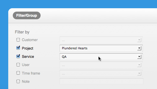
The menues inside the filter box can now be selected faster as well. Instead of activating the checkbox first to trigger the selects, the select menues can now be activated directly. Inactive selects are not hidden anymore, but differ visually instead.

Please note: the new version of the select menues won’t be available under Internet Explorer 7. Unfortunately, technical reasons forced us to stay with the old version, here.
Redesigned: Entries per page
Formerly available within the filter box, you can now specify how many entries you’d like to see in the footer area. Older entries are loaded via Ajax, right on the same page. Therefore, the former pagination is not available anymore.

Easier printing
On the right-hand side, within the sidebar, mite now serves a special print view of the list of all time entries. The print view which opens in a new window now displays all time entries corresponding with the current filters and/or groups, not only the first page, as it used to.
More to come
Stay tuned! More updates in the reporting section will be launched during the next months.
Julia in New features
Got something to add?